Mobile Navigation - As told by my little brother
While designing the navigation for F!ND, it was easy to go with my personal preference when deciding which navigation features I wanted. After all, I am the target demographic.
I performed usability tests on my roommates and friends, an accurate sample of my target users. I started with the dreaded hamburger menu, and finally made the transition to a bottom tab bar. Read here or here if you still need some convincing to make the switch.
The response was positive. Less clicks + less uncertainty = happier users. (And they said I would never use those 12 math classes I took in undergrad).
But what about a user who knew nothing about the app, nothing about the struggle of living somewhere new or meeting new friends outside of school? How about someone who had grown up with a smartphone glued to his hand? Now that was the opinion I needed.
I did a (very) rough sketch of the app – hamburger style – and presented it to my 18 year old brother.
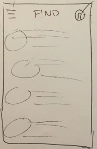
'hamburger' navigation
I asked him what he thought the top left symbol would direct you to, and he easily identified it as the menu. And the top right? “Probably your profile.” Clearly, he understood what they represented, but what about their content?
He knew the basic premise of the app, so I asked him what he expected to see once he revealed the menus. He listed off a variety of things he thought may appear, but the overwhelming opinion was that he wasn’t sure. He said, "It could be anything, but eventually I'll find it – so it's fine."
Then I sketched out the tab bar style navigation for him. I asked him what the various symbols/titles meant and what he expected to see behind them.
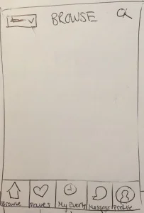
'tab bar' navigation
His correct responses were unsurprising for me, but watching him come to those realizations on his own was by far the best. At the end of the session I asked him which option he liked best.
"The second one. It’s much more visible. I know exactly what’s going to happen when I click each option. It’s everything I could expect to see in the first option, but I can see it right here."
Well said, kid.
Hamburger menus and their counterparts are blanket icons for what could be a million different choices, a malleability that is both their best and worst feature. This makes them universally recognizable and also universally frustrating.
So it’s not that the hamburger menu doesn’t get the job done. We’ve all accidentally stumbled upon something we’ve been looking for after 20 minutes of searching– but how happy were we when we finally got there?
Tab bar navigation exposes your users’ options and allows them to easily see what they can do and where they go to do it. It decreases the number of choices (and clicks) between a user and their end goal.
Have more than 5 menu choices? Design and iterate alternatives (such as a scrolling tab bar or ‘more’ tab, as explained here)
Tab bar navigation is nothing new – and if my 18 year old brother sees the benefit, what are you waiting for?